Like your children, every web form or checkout is unique. Each has disparate questions, varying field volumes, and particular visual design. Most importantly, they each have distinct audiences who will react differently to what they are being asked.
And yet. Strip down any form to its basics and you will tend to find the same building blocks. The vital organs as it were.
This article examines these vital organs that most forms have in common, addresses the frequent issues that arise, and outlines what you need to keep in mind when optimizing those sections and fields.
Vital Organ 1: Personal Details
The start of the form often seems the easiest. As explained in this CXL blog, the psychological principle of consistency implies that getting the user to engage with an “easy” action initially, makes it more likely that they will persist with the form and ultimately complete it. There’s a reason that forms don’t start with a 1,000-word essay question!
That said, it is still surprisingly easy to put users off at this stage and lose them forever. The common things to watch out for are:
Title Field
Asking for a title should be super simple right? Check out this example of a dropdown from upscale British department store Fortnum & Mason.
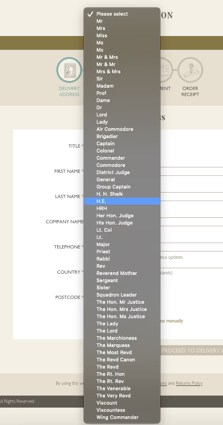
Making no judgments on Fortnum & Mason’s brand and customer base, a UI like this will send many customers running for the hills.
Why do we even ask for titles anyway? When was the last time you used your salutation in an email or old fashioned letter? Will users even notice if you don’t ask for it?
The real reason to ask, of course, isn’t for the benefit of the customer. It is so the business can indirectly ascertain your gender and put you into a “pot” for marketing and data purposes. Something which can lead to a disregard for non-binary genders and lead to a lack of inclusivity too.
In particular scenarios this data might be valuable or necessary but, if not, scrap the title field. At the very least, get rid of that dropdown and replace it with a simple radio or free text field (This CXL study indicated that radio buttons are completed on average 2.5 seconds quicker than drop downs).
Name Fields
Again, shouldn’t this be simple? Who forgets their own name?
The danger with name fields is to fall into a eurocentric view of the world and its naming conventions.
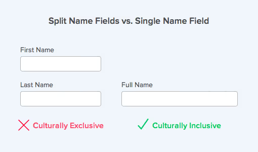
Many companies split out their fields into First Name and Family / Surname. That makes it nice and easy to slot the new registrant into our database and crank up the marketing sausage machine.
Consider, especially if you are a global company if this in fact works as a good experience for all of your potential customers. If your user is from Latin America they may have two (or more) family names that they use on all official documents. What should they put on your form? Similarly, Asian users may put their family name first. I’ve also seen forms that are built with minimum and maximum character restrictions on names, leading to people not being able to enter their details as the forms deem their names as invalid.
As always, as a matter of principle, you should put the user's needs before that of your system. Use a single “Full Name” field rather than trying to split it out and get your system to adapt it at the back end accordingly.
Address & Postcode Fields
If your customers come from a single geography, a well-implemented address lookup or autocomplete such as this example from the UK should help smooth the user’s passage through this field. If you don’t have this luxury, though, you need to be extra careful. The name of the game is simplicity; label your fields to avoid confusion amongst your international audience. Some specific areas to avoid tripping up are:
“Address Line 2” - This study by the Baymard Institute revealed a surprising level of distraction and friction around “Address Line 2” fields. Users don’t always know what to make of it. What if they only have one line of their address? What if they have 4? What goes into “Address Line 1” and what into “Address Line 2”? Can they use commas to separate lines or not? The Baymard Institute’s recommendation is to hide this field behind a link to avoid the distraction whilst still letting the user provide their full address if desired. At the very least you should make it clear that Address Line 2 is optional.
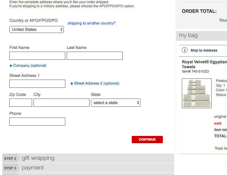
Be specific - Do you use “Address”, “Current Address”, “Delivery Address” or “Residence Address” in your eCommerce checkout? Is that the same as “Billing Address”? Make it crystal clear which of these inputs you need unless you want to have to deal with a raft of mis-delivered products or failed payments.

Date of Birth Field
Again, cultural differences can cause friction around this particular field. This is why you should steer clear of an aggregated MM/DD/YYYY text field implementation like this example below.

If you use this format users will inevitably use their own heuristics to complete it in the way they anticipate it should be completed. They may be tripped up if you are insisting on the American (MM/DD/YYYY) or European (DD/MM/YYYY) convention while they are expecting the opposite. Also, there may be friction if you insist on a four-digit answer for the year when they are hoping two digits will suffice.
To make things simpler, some forms use a dropdown for the date options. You should still avoid this method for all the reasons dropdowns don’t deliver great UX. A date picker is better but can still be fiddly, especially for those of us who have to click back a long way to our year of birth.
There is a better option. Eye-tracking research commissioned by Zuko revealed that simple, separate text boxes that were clearly labeled required the lowest amount of eye fixations and were completed in the shortest time. This is a simple user-friendly method to cut out the potential frustration and friction around this field.

Phone Number Field
The phone (or mobile) number field probably has the largest number of ways that a user could potentially input their data. The potential for confusion is obvious - this study indicated that 89% of test subjects entered their phone number in a different format from what the site had asked for.
Users are discombobulated on a number of angles. Should they add the country code? If so, does there need to be a “+”? Should they remove the “0” from their number? Should they include parentheses around the area code? What happens if they include spaces?
Removing the need to think is crucial here. It should be obvious what format is necessary. Good instructional microcopy and flexible formatting (where multiple formats are accepted with the system adapting them at the back end) can play a part here. However, the gold standard is to auto-format the input based on the user's geolocation. As the user types, the field displays the “correct” input removing any uncertainty.

Above all, be clear about why you need their phone number. It is probably the most sensitive of the personal data fields; many users are suspicious that it will be used for nefarious purposes. This Baymard Institute study showed that unexplained phone fields were a direct cause of abandonment. If you don’t need their phone number then don’t ask for it. If you do need it, make sure you tell them why.
Email Address Field
Of all the common personal detail fields, Email Address is the field that users seem to take more time over, illustrated by this average data from Zuko’s form database.
Field - Average Time Spent (seconds)
- Name - 4.6
- Address (First Line) - 6.9
- Postcode / Zipcode - 5.1
- Mobile Number - 6
- Email Address - 14.5
- Password - 13.3
Why is this?
Two reasons. Firstly, it can be a mobile UI issue. Breaking down the above data showed that users on mobile devices spent, on average, 2 seconds longer than those on desktop devices to complete the email field. Always make sure that the HTML for mobile devices includes “@” and “.com” on the mobile keyboard or users will be fiddling around to try and enter the correct address.
More commonly, this can be due to email confirmation fields. Many businesses are paranoid that users will mistakenly input their email address. To avoid this, they require users to enter their details twice, despite the evidence that this delivers a bad user experience and most users just copy and paste their email anyway, negating the benefit in the first place. Better to have a sophisticated inline validation solution that will pick up most of the common errors and get the user to rectify them before they submit.
Vital Organ 2: The “Flesh”
The section between the personal details and the final submit tends to be the most distinct and customized to that form. Given that diversity, I won’t go into great detail about the “Flesh” in this article. However, there is some insight that came out of a benchmarking study by Zuko that is relevant here.
The received wisdom in the optimization community has been that, to maximize your form conversion, you should strip the number of fields down to the bare minimum. Every field that you add is a point of friction that could cause users to abandon.
This isn’t necessarily the case. One recent study even showed a decrease in conversion when fields were reduced. This is backed up by data from Zuko’s benchmarking study.
The graph below plots different forms’ conversion rates against the number of fields they contain. The straight line is the trend across all the forms. It is flat. This conclusion from this is that, on average, the number of fields in a form makes no difference to its conversion rate.

Of course, this isn’t a license to add as many fields as you like to your form and expect that performance won’t be affected. What it means instead, is that form length in itself does not dictate conversion rates. If fields are relevant, easy to complete, and are what the user would expect to encounter, then including them in your form shouldn’t have a negative effect.
Vital Organ 3: Financial Details
Mainly used in eCommerce checkouts, asking for a user’s card details needs to be approached with care. Data from Zuko’s benchmarks showed that between 40-50% of customers return to credit card number fields at least once, making them one of the biggest drivers of field returns and friction. You also have the issue of the user switching from fields they know from memory (name, address, etc), to having to open their wallet/purse and find the right bank card. You don’t want to put any more unnecessary hurdles in their way at this stage.
Things to look out for in this part of the form are:
Unnecessary information
Many checkouts seem to think it is still the 1990’s and ask for all sorts of superfluous information. You don’t need to ask for these things anymore:
- Card Types - your system can determine the type of card it is by the initial digits so you don’t need an ugly drop down menu
- Bank Name / Address - Again, your system should be able to pull that in from the bank code the user gives you
- Start Date - This is irrelevant to processing payment so remove it from your checkout
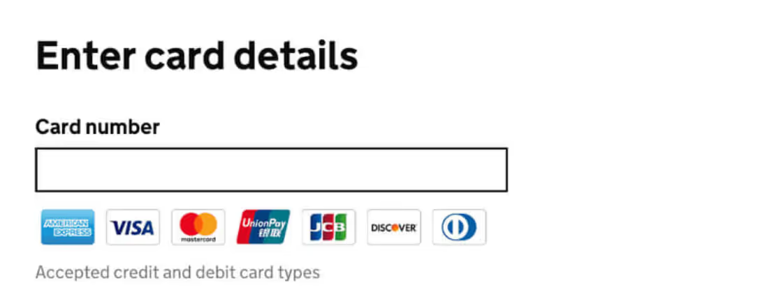
Be clear which payment methods you accept upfront
You don’t want a user getting all the way through your checkout only to find that they can’t pay with their Diners Club card. Best to manage their expectations early, ideally before they enter their card details. Here a good visual example from the UK government design system.
Label your fields unambiguously
Confusion is the enemy of completion so be careful in how you label your fields. Specifically:
Card Holder - You will almost always want the name of the cardholder rather than the purchaser (assuming they are different). We prefer using “Name on Card” as the most elegant way to make this clear.
Security Code - This simple 3 digit code has various names (CVV2, CVC, CID), depending on the card company. While the population is now broadly aware of this code, to avoid potential confusion we find it is best to go broad with this label by using “Security Code” or similar. Providing a visual example like the one below of where to find the security code can also help users who are still unfamiliar with this.
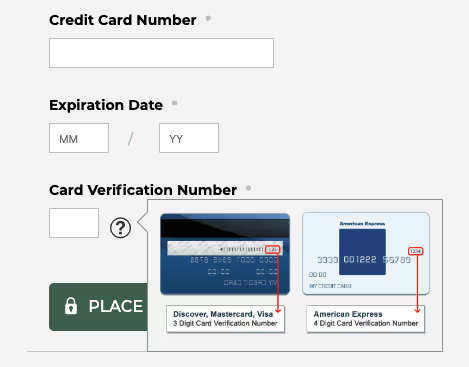
An additional note of caution; American Express has a 4 digit security code so make sure your checkout accommodates this or you’ll inadvertently be excluding a whole class of users from purchasing.
Vital Organ 4: Submit
So, you have done all the hard work. You’ve got the user to the form and persuaded them to part with their personal information. They just have to click that one last button and they’re done.
And yet, many users that have got to this stage still end up abandoning the form. What can you do to prevent this?
Make sure your label is compelling
You shouldn’t just label your final button “Submit”. This does not tell the user what clicking the button will do. It is a technical action (probably inserted by your developers rather than your UX specialist) rather than a consumer-led one.
You can expand on this by using “Submit Registration”, “Submit Request” or “Submit Details” but we’d advise being even more specific with something like “Create Account”, “Reserve my Seat” or “Download the Report Now”.
Make the button visible
If your user can’t see your call to action they can’t click it.
Your Submit button should be just that. A button. It shouldn’t be an image, a text link, or a random table. Users will be looking for a button so don’t confound their expectations.
Some specifics on how to make this clearer are:
- Colour - Studies have shown that red buttons perform better although some advocate orange or green. The main principle to follow is to ensure it stands out from the rest of the site.
- Position - Put the button where the users expect it to be. This should be immediately after the last question on the form unless there is a very good reason to put it elsewhere.
- Sizing - Be impactful but don’t go overboard. Sometimes a bigger button performs worse.
Measure what happens next
If you are getting users dropping out after trying to submit, you need to dig deeper. Ideally, your form analytics software should enable you to accurately map the user journey and identify the points of friction. Unless there is a technical issue with submitting (not unheard of), the answer will usually lie in previously completed fields rather than the button itself. Look for answers to these questions:
- Which form fields did the user return to after clicking submit? This will give you an idea of where they have not been able to input the correct data.
- What error messages were shown? Are these messages clear and helpful or could they be misleading? Test them out on a “civilian” to see if they are as clear as you believe.
- Do users return multiple times to the same part of the form to rectify things? If they go back more than once to a field yet still can’t progress you need to review your microcopy and error messages around that field.
- Did they go somewhere else on your site? Are you distracting them away so that they never return to finish the form?
Summary
We’ve come to the end of this analogy comparing a form with the human body. While it was, admittedly, a little forced, the main point stands. The building blocks of most forms are similar. Learnings derived from one can be tested across others and usually deliver similar results. Hopefully, the research shared in this article will be useful as you undergo your form optimization programs.


.avif)


.svg)
