
For many, data provides a reassuring sense of truth in a world of fake news, clickbait, and sensationalism. But the integrity of data depends entirely on how it was gathered, who conducted it, and how it was analyzed. Even in the hands of a dependable source, data is often skewed or communicated in a way that paints a certain picture.
To avoid being deceived by data, here's what you need to know.
Common reasons why data is deceptive
In 1958, Darrell Huff wrote the bestseller "How to Lie With Statistics” - so data deception isn’t new, and isn't always the result of a hidden agenda. Misleading information can occur usually due to these three main reasons:
- The analyst is a subject matter expert but not a statistician. Or conversely, the analyst is a statistician but not a subject matter expert.
- The quality of the data is poor.
- Data is used to support an agenda e.g media outlets often have limited expertise and mixed motives. And as Andrew Lang, the Scottish novelist once said; “Politicians use statistics in the same way that a drunk uses a lamp post—for support rather than illumination”
To save yourself from falling victim to deceptive data, here are the common root causes that lead to data being used incorrectly.
Small sample sizes
We often see celebratory case studies declaring "90% of people loved our product" But look at the small print and you often find that only ten people were asked in the first place.
If the data seems too good to be true, it often is. As Speero founder Peep Laja explains:
“So you ran a test where B beat A, and it was an impressive lift – perhaps +30%, +50%, or even +100%. And then you look at the absolute numbers and see that the sample size was something like 425 visitors. If B was 100% better, it could be 21 vs 42 conversions.
BUT – hold your horses. Calculating statistical significance is an exercise in algebra, it’s not telling you what the reality is.
The thing is that since the sample size is so tiny (only 425 visitors), it’s prone to change dramatically if you keep the experiment going and increase the sample (the lift either vanishes or becomes much smaller, regression toward the mean).”
The smaller the data set used, the more likely the results are to fluctuate when extrapolated to a larger audience. With a large sample size, you're more likely to see a result that's closer to the truth. When you're reviewing any data, be sure to check the sample size - especially if it seems too good to be true.
Unrepresentative samples
For data to carry any weight, it needs to be collected from a representative sample.
Imagine you were researching what percentage of the US were planning to watch the next big basketball game. If you surveyed your friends on your local basketball team, it wouldn't be at all surprising if all your basketball friends were planning to tune in to the game. But if you asked everyone on your street, these results would likely look very different.
Take surveys, one of the biggest offenders of unrepresentative data due to “convenience” samples. You need to work hard to ensure respondents are representative of the whole population. That means they should represent the demographics, purchase frequency, or same levels of familiarity with your brand as your whole population (or other defining traits). Otherwise, it’s easy to overgeneralize your finding when you shouldn’t.
Cherry Picking or Biased Samples
Similar to unrepresentative samples, cherry-picked samples focus on a subset of people that could skew the results. Cherry-picking, however, is done deliberately to support an argument or narrative held by the researcher.
For example, companies could choose to only send surveys to repeat customers - who are more likely to rate your services highly. Or they could even cherry-pick customers who left glowing reviews.
While it's hard to determine whether or not a sample was cherry-picked, it's always worth bearing in mind when you read data that doesn't seem to add up.
Correlation doesn't equal Causation
One of the first rules in carrying out any data analysis is to remember that cause and effect don't always go hand in hand. Lisa Simpson explains it best:
Just because tigers hadn't attacked Springfield since the rock appeared in their yard, doesn't mean the rock repelled tigers. In any situation, it's important to be aware that two situations that have a correlational coefficient aren't necessarily linked unless proven otherwise.
But correlational data can be valuable when it comes to experiment ideation. If, for example, you see that people who download a PDF have higher customer lifetime value (CLTV)–an idea might be to attempt to get more people to download the PDF and see it increases CLTV.
How is the data communicated?
Regardless of how the data was collected, the way it’s communicated can significantly impact its interpretation.
In the media, studies are often described with specific phrases that mislead readers. For example, while we know correlation doesn't equal causation, the way the data is communicated could imply otherwise: "therefore this happened" or "because of this" type phrases paint a certain picture.
It's a kind of narrative fallacy that explains past events with no bearing on reality. Take a look at this explanation from The West Wing:
Essentially, it's all too easy to say that certain actions led to specific results - despite that not being the case at all. If you carry out an A/B test during a period where you typically experience high sales, don't credit the uplift in conversion rates to your change. You always need to take external factors into account, such as seasonality.
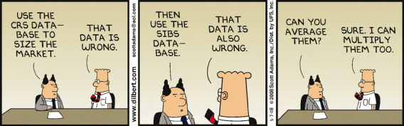
Averages can be misleading
Mathematically, the 'average' can be three different things:
- Mean average
- Median average
- Mode average
Depending on which method you use to support your study, the overall outcome could shift significantly.
If you used the numbers 3, 3, 5, 4, and 7, the mean would be 4.4 ((3+3+5+4+7)/5), the median would be 4 (since two of the numbers are higher than 4 and two are lower), and the mode would be 3 (since it occurs most frequently).
When data sets use the mean average, it's important to be wary of any major outliers that could significantly skew the results. If the statistic is revealing the average wage in your local area, just one millionaire respondent would massively increase the overall result.
It's important to remember this when you're carrying out A/B tests. Only looking at the average could result in missed insights, as you won't see any discrepancies in your audience. As Peep Laja explains:
“Always keep in mind that only looking at average numbers in your analysis will lead you astray. There are no average visitors—you must segment ruthlessly.
Look at new vs. returning visitors, check performance across different devices and browsers, and buyers vs. non-buyers. What’s working for one segment might not work for another, and personalization could make you a ton of money.”
Data Visualization Tricks
Along with sneaky methods of storytelling, it's also important to look out for misleading data visualization tactics. How the data is displayed can often portray different results.
Whether it's purposefully misleading or just clumsy, this image doesn't reveal the truth behind the stats. You often find this occurs with media outlets and journalists keen to push a certain narrative - regardless of their findings.
Pie Charts
Pie charts are some of the worst offenders when it comes to misleading visualization. They're hard to read at the best of times and can easily distort proportions. Take a look at these three seemingly-similar pie charts:
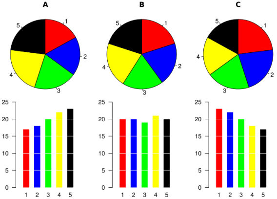
The corresponding bar charts reveal a much more accurate story. It's easy to see why some people might favor pie charts if they were trying to downplay something.
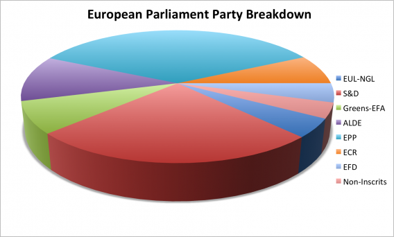
When you look at 3D pie charts, the problem is exacerbated. As the chart is on its side, the closest segment seems to be much bigger than it actually is - despite it being significantly smaller than other segments.
While pie charts are great for displaying simple information, it's always good to be wary of what you see in the charts vs. the actual data.
Cropped Axes
Depending on where your Y-axis starts, a bar graph can look significantly different. Here's an example from Data36:
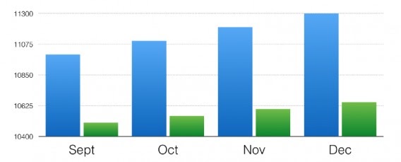
Looks like there’s a massive difference between the data sets, doesn't it?
However, here's what the graph looks like when the Y-axis starts from zero:
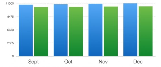
This visualization tactic is often used for shock purposes. Whenever you see a bar chart, make sure you consider what the results would look like using a different baseline.
Conclusion
People assume that quantitative data is objective by its very nature. However, like anything else, data is subject to personal bias and specific narratives.
The main takeaway is to be skeptical: always. Instead of accepting data at face value, try digging a bit deeper to see the true picture.


.svg)
