Speero has been running experimentation and customer research programs since 2011, when we started as CXL, for more than 250 brands. Supplements and wellness is one of the categories we know best. We've worked with more than a dozen brands in it, from single-ingredient specialists and subscription blends to broad catalogs and pet supplements, and run more than 1,000 tests and hundreds of research studies along the way.
For this piece I went back through that record, leaning most on four programs (a magnesium specialist, a women's wellness brand, a subscription supplement brand and a broad supplement catalog), and one pattern keeps coming up. The tests that won mostly cut the work a shopper had to do to decide. The tests that lost mostly added work, or asked for something at the wrong moment.
Which sounds obvious when I write it down. It wasn't obvious to me going in, tbh. A lot of the ideas that lost were standard playbook moves: a money-back guarantee next to the checkout button, a sticky add-to-cart bar, skipping the cart and sending people straight to checkout. Each one looked like it should help. Several of them cost purchases.
So this is less a list of tactics and more a map of where the effort sits in a supplement purchase, plus the tests that showed us where it doesn't.
One note on how I report results. These are client programs, so I describe outcomes by direction (more purchases, fewer, flat) and leave out the figures. Where a result was weak or the test had problems, I say so. I'm biased, I'm a tester, and I'd rather show you a messy result honestly than a clean one I can't defend.
TL;DR: Find where the effort sits before you change anything. Test the commitment as well as the copy. Judge every test on completed purchases, not the click before it. And treat the reorder as the real business, because that is where our own evidence is thinnest.
The same store sells two different purchases
A bottle of magnesium can be a routine reorder. The same bottle can also send a first-time buyer into an evening of comparing forms, reading reviews and wondering whether they need it at all.
There's an old idea in foraging ecology (Eric Charnov's marginal value theorem) that an animal leaves a patch once what it's getting there drops below what it could get by moving on. Shoppers forage too. A first-time buyer of an unfamiliar blend will spend a lot of effort deciding, and will leave when the effort stops paying off. A repeat buyer wants to spend almost none. Same product, same store, very different effort budgets.
Catalog size is a separate axis. A store with three SKUs can still ask for hard decisions about suitability, quantity, subscription and daily use. A retailer with thousands of SKUs can make a known reorder trivial. Crossing the two gives four starting points:
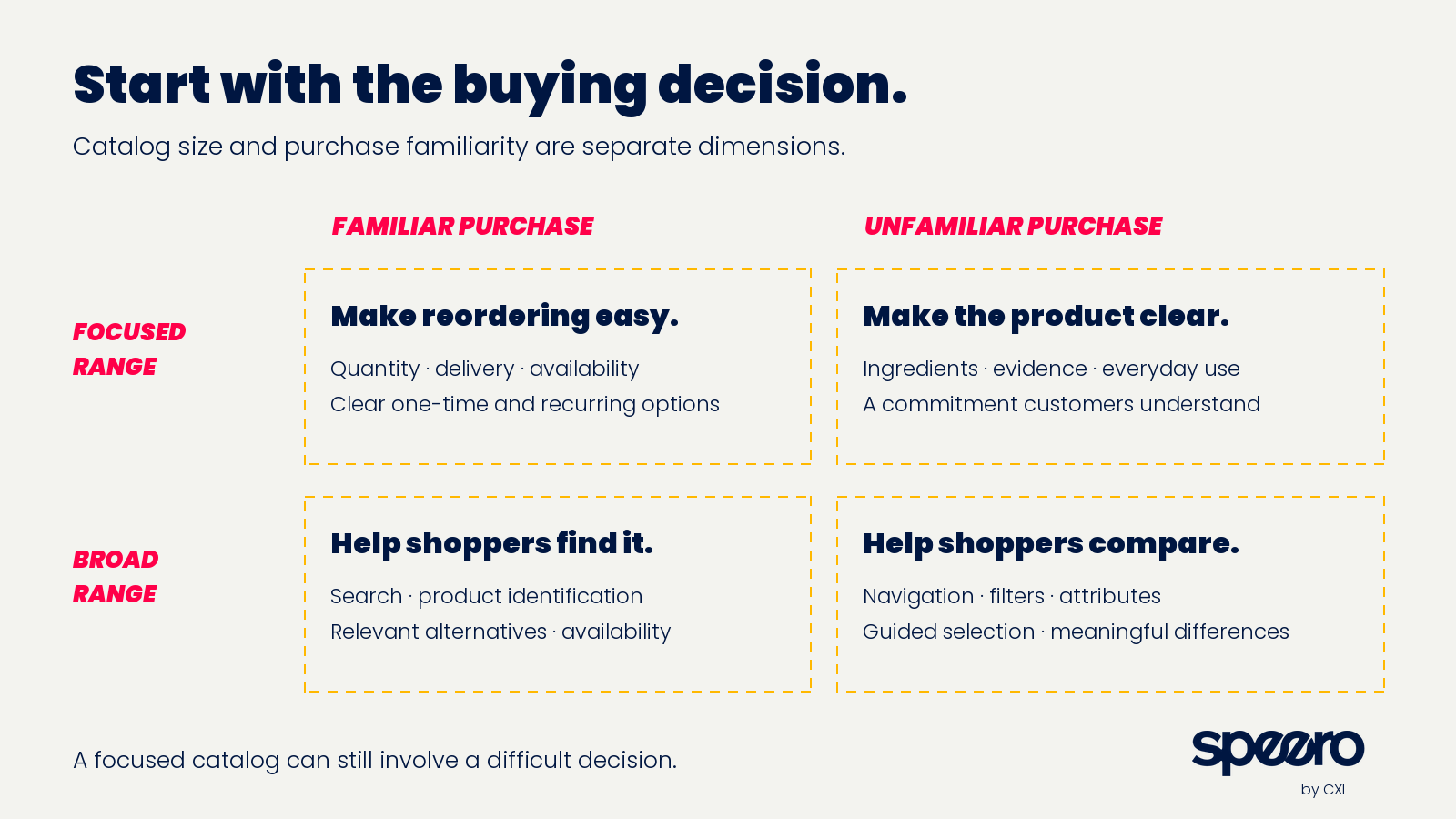
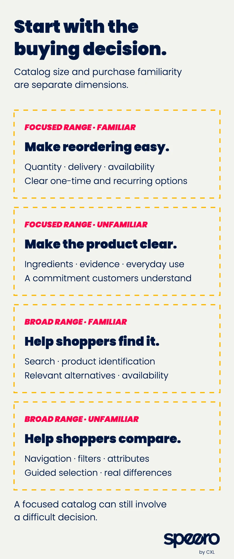
Treat the boxes as hypotheses about intent. A traffic source alone won't tell you which box someone is in. Search queries, landing pages, purchase history and customer research will get you closer.
The grid also explains why "reduce choice" is incomplete advice. In their 2015 meta-analysis of choice overload, Alexander Chernev, Ulf Böckenholt and Joseph Goodman found that a big assortment hurts mainly when the options are complex, the decision is hard, people are unsure what they want and they're trying to get it over with. Assortment size on its own explains less than people assume. The practical question is whether shoppers can understand the choices in front of them.
Make the product explainable before you make it persuasive
In usability research for the magnesium specialist, the friction came from basic questions about use. Participants struggled to find daily-use instructions. They wanted to know how much effort taking it would involve and how to raise it with a healthcare professional alongside other supplements. Quantity options, and images that didn't match the product information, added more work. That was usability research, so it found problems worth fixing. It didn't measure a conversion effect from any particular fix.
It does kill the assumption that a focused store leaves the customer with little to decide.
The research task I'd run on any supplement product page is simple to describe and hard to pass. Ask people to find the answers, then ask them to explain, in their own words:
- What's in it, and how it differs from the thing they're comparing it to.
- What the brand actually claims, and what backs that up.
- How you take it (form, preparation, serving, cautions).
- What arrives, what they pay today and what happens after that.
"Does this page feel trustworthy?" gives you a much weaker diagnosis than watching someone try to work out what they'd be buying.
Two tests point the same way. For the women's wellness brand, making the ingredient list easier to understand increased transactions and revenue per visitor. That supports clearer ingredient presentation in that context. It doesn't say every visitor wants a longer science lesson.
For the subscription brand, we exposed the supporting product images that most visitors never reached. On desktop the variant laid every image out in a grid, all visible at once. On mobile it used a carousel that still needed a swipe. Desktop purchases trended up (a directional read, not a conclusive one). On mobile, engagement and add-to-cart went up but purchases didn't follow and trended slightly down, and because mobile carries most of the traffic the overall result was flat. My read: seeing everything at once helped people decide, and the carousel created interaction without creating commitment. Engagement and commitment are different things. The next step there is a mobile layout that shows the images without a swipe, tested on its own.
A different lesson came from a full hero-image package (new lifestyle creative, a new value proposition and a category claim). It came back flat, and flat with a tight interval, so anything beyond a small effect in either direction was ruled out. Because the package changed several things at once, a win wouldn't have told us which element mattered anyway. The useful finding is that the default hero image isn't a purchase lever on that page, so the team can choose it on brand grounds and stop spending traffic on the question. A precise null is a finding. It's one of the more underrated ones.
Match the evidence to the question the shopper is asking
"Add more trust" is too vague to be a hypothesis. Someone asking whether the label is accurate needs a different answer from someone asking whether the finished formula has been studied, and someone worried about taste needs a demo more than another expert portrait.
The legal side shapes what you can test. In the US, the FTC's Health Products Compliance Guidance requires competent and reliable scientific evidence for health claims, says testimonials don't substitute for it, and asks whether the studies you cite match your actual product's formulation and dose. One of its own examples is a drink whose two ingredients were each studied alone; the guidance says that may not support a claim about the combination. Quality seals are a separate question. The NIH Office of Dietary Supplements notes that seals from groups like USP, NSF and ConsumerLab indicate proper manufacturing, label accuracy and no harmful contaminant levels, and don't guarantee a product is safe or effective.
So for testing, keep the approved claims fixed and test how clearly people understand the evidence and its limits. A purchase experiment can tell you how a presentation changes buying. It can't tell you anything about a health benefit.
Removing a step only helps if the step was dead weight
This is the pair of tests I'd show anyone who says "fewer clicks always wins."
In one subscription program, offer landing page visitors had to click through to a product page before they could buy. Test one added a buy box to the landing page itself. Purchases went up. The biggest gain was at add-to-cart, and it shrank through checkout because the extra buyers were a bit less committed than the ones who'd have bought anyway. Mobile carried the result; desktop traffic was too small to read alone.
Test two, similar traffic: route the landing page buttons to a product page that sent people straight to checkout, skipping the cart. Purchases went down. Clicks on the landing page barely moved, so the loss happened after people left it. On mobile, fewer visitors added to cart on the direct-to-checkout page, and the ones who did add bought at the usual rate.
Both tests removed a step. One helped and one hurt. The product page was dead weight for that traffic, since the landing page had already built enough intent. My guess (and it's a guess) about the second test is that a button going straight to payment reads as a bigger commitment than one that adds to a cart, and on a recurring product people hesitate at the bigger ask.
The rule I take from this: find where people actually drop before you remove anything, and measure completed purchases, never the click you made easier.
Put reassurance where the doubt forms
One cart drawer we worked on had an empty slot under the checkout button, and over time it carried several different ideas, including shipping speed and a money-back guarantee. Looking back, the constant was the empty space, not a diagnosed customer problem. That's worth admitting because it's such a common way for test ideas to get born.
The guarantee line leaned negative and stayed negative for the whole run. The team called it early, before the planned runtime, which I'd flag honestly: the pre-committed stopping rule got overridden on cost grounds. Two readings fit. Either financial risk wasn't the live objection at that moment (by the time someone's looking at a full cart, the price decision is mostly made), or naming the risk raised a doubt that wasn't there before. Either way, the result says nothing about whether the guarantee helps earlier, on the product page, where the price objection actually forms.
Swapping the guarantee for a fast-shipping message in the same slot split by device. On mobile it clearly lifted checkout starts and purchases trended up, though not conclusively. Desktop went the other way and the overall result was flat, so the team kept the message on mobile only.
A sticky add-to-cart bar on the product page fits the same family. No lift, leaned negative, and the result ruled out any effect big enough to care about. The team retired the pattern.
My working rule for supplement carts now: trust and risk messaging belongs upstream, on the pages where people weigh the price. The space under the primary button is for whatever removes friction from the next step. It isn't a billboard.
Test the commitment as well as the copy
Supplement brands often ask a new customer to commit before they've tried the product. People can understand the offer and still hesitate over how much they have to buy, what they pay today or the recurring charge. Better copy won't fix every offer problem.
Two separate tests at the women's wellness brand make a useful contrast. A shorter subscription-plan option increased transactions, with a positive revenue-per-user estimate and a lower average order value. Reframing the subscription as a "membership" reduced transactions and revenue per user. They weren't designed as a head-to-head, but together they raise the right research question: is the customer struggling with how the commitment is described, or with the commitment itself? Also worth saying plainly, the shorter-plan test didn't establish better retention. Its forecast of future customer value is still a forecast.
Metric choice matters as much as framing. In the subscription program, a homepage hero that laid out the product range came back flat on purchase rate while revenue per visitor went up, because people who bought chose bigger orders. Judge that test on purchase rate and it's a dud. Judge it on revenue per visitor and it's a promising iteration. That's the whole argument for picking the primary metric before launch.
Keep the actual terms clear whatever you test: what's charged now, what arrives, future billing, delivery frequency and how to manage the subscription. Confusion about those terms isn't a source of growth you want. And decide the commercial measure up front, because an offer can produce more orders while lowering order value, or lift subscription take-up while raising cancellations. Margin, fulfillment, promotions, refunds and observed later orders over an agreed period all belong in the decision.
For a broad catalog, help people find and compare
Our research for the broad supplement catalog found two kinds of shopper on the same site. Some arrived knowing the ingredient they wanted. Others arrived with a goal and needed help narrowing the range. Creative product names made both jobs harder, search and category pages filtered differently, and competing discount formats made value hard to compare. These were research findings, not test results, but they're a strong basis for a program when you add search and purchase data.
A few principles held up across that work.
Test the routes separately. Someone looking for a known ingredient should find it directly, without learning the brand's naming system or taking a quiz. Someone exploring a goal needs a way to narrow without already knowing the category. Good research tasks are finding a known product, finding a substitute for an out-of-stock item and comparing products in a category, run with people who actually face those decisions. For multibrand retailers the same applies to brand names, ingredient synonyms, forms and pack sizes, and a substitute shouldn't be presented as therapeutically interchangeable just because it shares an ingredient.
Fix the product data before the filters. More filters won't help if the attributes underneath are inconsistent. Baymard's usability research found that once shoppers see an attribute in the product list, many want to filter by it, and a lot of sites don't let them. For supplements that means ingredients, form, labeled serving, pack contents and dietary attributes, with unknowns kept as unknowns. Price per serving can save shoppers some arithmetic when serving definitions are clear, but it can't establish that two different formulas are equivalent.
Time cross-sells around the first decision. In some catalog journeys, people were asked to add more products before they understood the first one. Commercial affinity isn't evidence that two products should be taken together, so compatibility guidance needs proper review. Judge the whole basket too, since a promoted item can win by taking sales from another one, and a bundle can raise order value while lowering the share of people who finish.
Quizzes work by placement more than by length
One subscription site had no quiz entry in its navigation, even though the people who found the quiz behaved well. Replacing the "shop all" link with a quiz entry got fewer clicks than the link it replaced, far more quiz completions and more purchases. The purchase gain showed up at checkout rather than at add-to-cart, which reads like better-qualified shoppers rather than more of them. If the team had optimized for clicks on that menu item, they'd have killed a winner.
The women's wellness brand had two placement wins. Returning visitors who had already finished the assessment got calls to action that took them back to their recommended product instead of asking them to start over, which increased transactions and revenue per visitor. Moving the contact-details request to the end of the assessment increased orders and revenue per visitor.
So test the whole run from invitation to recommendation to purchase. Check that people understand why a product was suggested, that their answers actually change the recommendation and that returning visitors can pick up where they left off. Keep direct shopping available for people who don't need a quiz. And keep sensitive health answers out of your ad tracking. The FTC's technology team wrote up how tracking pixels shared health information in its GoodRx and BetterHelp cases, and it's worth a read before anyone wires quiz answers into a pixel. We've written more about the different jobs ecommerce quizzes can do.
Carry the ad's promise onto the page, and check your "ties"
An ad starts the purchase. Its promise sets an expectation the landing page, offer, checkout and product all have to keep.
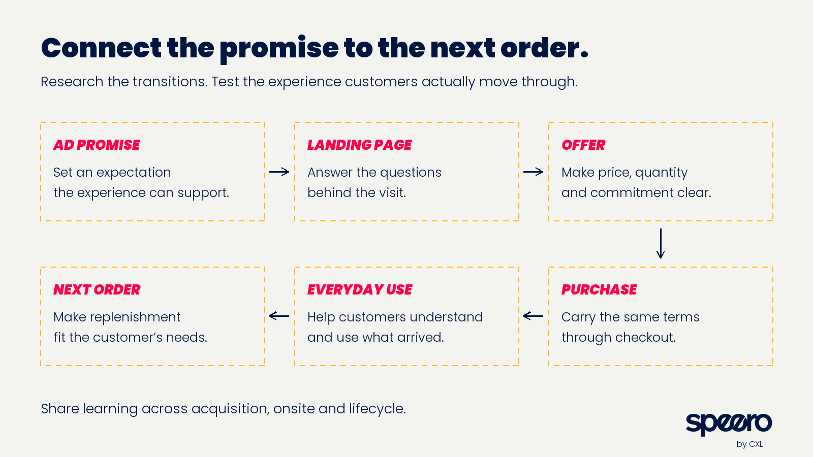
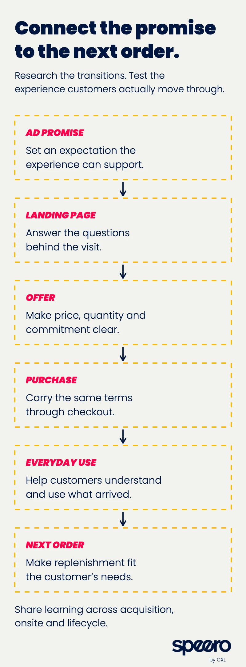
On one referral landing page, visitors arrived after being promised a specific offer, and the hero opened with a generic benefit claim instead. A headline that confirmed the offer by name lifted onward clicks. The purchase effect couldn't be read at that page's traffic (it would have taken many months), so the team shipped on directional evidence and treated message match for referred traffic as the learning to carry to bigger referral pages.
Another result I'd put in front of anyone running a multi-armed bandit. Two proof-led headlines on a paid landing page came back as a tie with control. The tie wasn't real. The bandit kept returning visitors in the arm they were first assigned to while sending new visitors by the current weights, so the variants ended up with a much larger share of returning visitors, who convert far better. Restricting to new visitors (almost all of a cold paid page's audience) pointed to both new headlines doing worse. That cut was post hoc, so I'd call it a strong warning, not a proven loss. The test had also been sized to detect only a very large swing, much bigger than a headline change usually produces, so it couldn't have answered the question cleanly from the start. Check arm composition on any bandit, and run a quick sample size check before launch to see whether the effect you can detect is one you'd ever expect.
At the women's wellness brand, a homepage test borrowed the message and social proof from a winning landing page and came back flat. The original wasn't wrong. A homepage serves a different mix of visitors, and a winning message is a hypothesis to retest in its next context.
A few measurement rules keep paid and onsite work honest:
- Randomly assign visitors from the same traffic stream to page variants. Sending different ad sets to different pages mixes page performance with audience differences.
- If the ad and the page change together, the treatment is the whole package. You'll learn whether the package works, not which half did it.
- A site test can't tell you whether advertising creates extra customers. That needs a holdout, such as Google's Conversion Lift studies split by users or by geography.
- Decide up front how you'll treat marketplace or retail purchases your site can't see, and split new customers from existing ones before anyone uses an onsite win to justify more acquisition spend.
Speero's landing page optimisation recipe is a good starting structure for diagnosing message and offer mismatch before you pick the next variant.
Measure the purchase, not the step before it
The homepage test I learned the most from bundled three changes: new product cards, a price comparison moved higher and ingredient content moved higher. Add-to-cart and checkout starts went up. Purchases went down, on every device, with a strong negative read even over a short run. Something in the new experience pushed more people into the buying flow and then lost them. Because three things changed at once, the team couldn't say which one, so the next step was to test them separately, starting with the product cards.
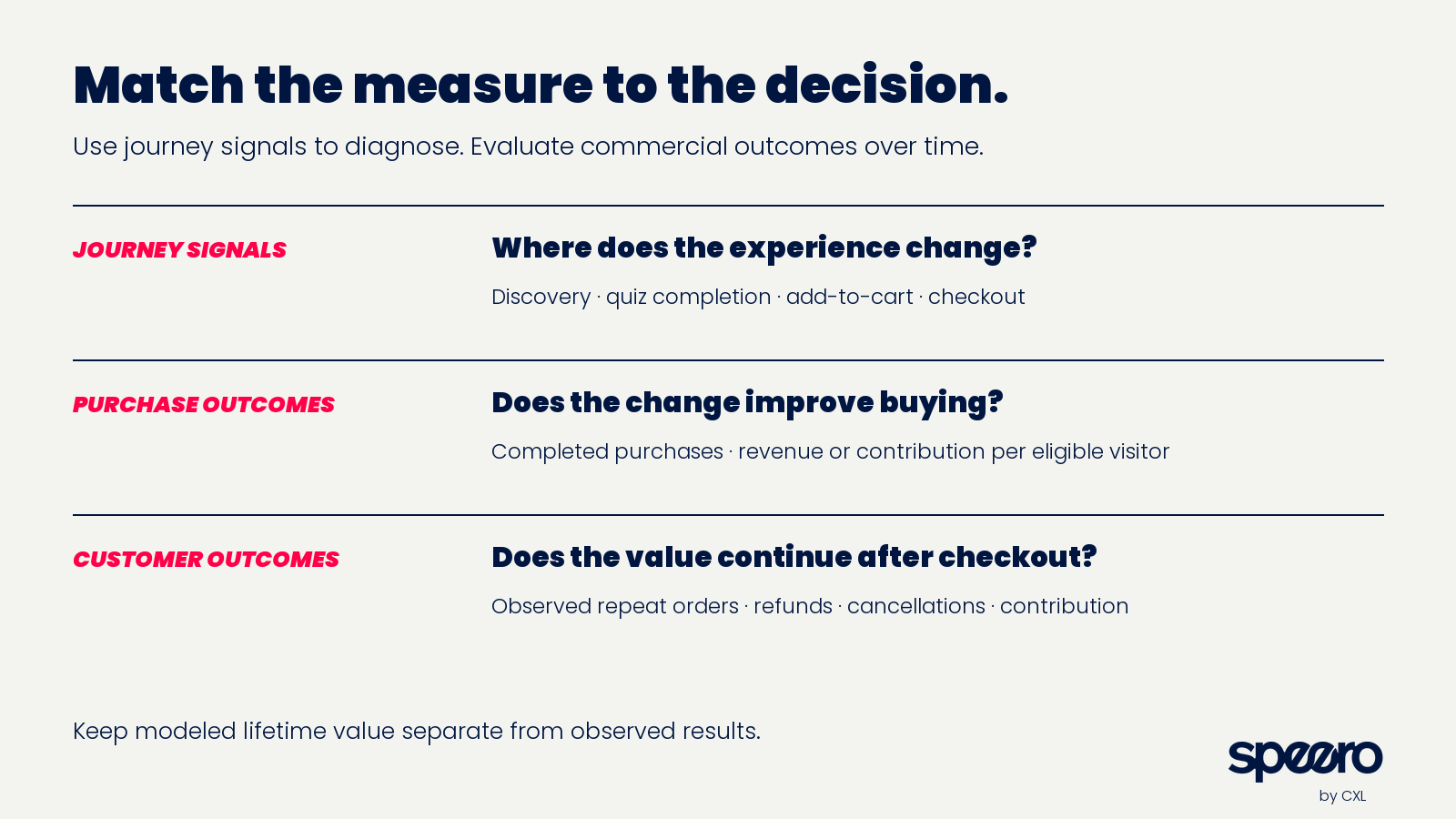
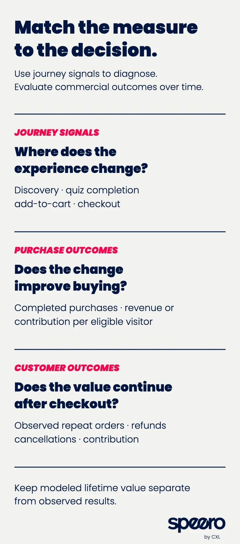
That's why a test brief needs more than a design and an add-to-cart target. Before launch, write down the eligible audience, the unit of assignment, one primary metric, the observation period and the guardrails you'd roll back for. Keep visitors in the same variant across return visits where you can, and note what can't be joined across devices.
Pick the primary metric for the decision you're making. Completed purchases suit a usability change. Revenue or contribution per eligible visitor suits an offer that changes price, quantity or mix, and it has to include people who didn't buy, because order value alone describes buyers and hides lost orders. Use intermediate metrics to understand a result, never to declare one. We've written more on picking experimentation metrics and on why conversion rate is a business metric more than a website one.
Plan runtime around eligible traffic, the smallest effect worth detecting, weekly patterns and how long the measured behavior takes. Use a planned stopping rule or a proper sequential method, and don't end a test early because it looks good for a few days. With low traffic, spend research on removing weak ideas before anything gets built, and be honest when traffic can't settle a question. Treat segment results (a win that looks stronger on mobile, say) as leads for the next test, and plan the comparisons that matter before you look.
Report the losses and the precise nulls next to the wins. Several of the most useful results above were losses that stopped a bad idea from shipping, and our reporting blueprint treats a loss as a save for exactly that reason.
After checkout, the reorder is the business
For a consumable, checkout starts a new set of decisions. The customer has to receive it, understand it, fit it into their routine and decide to order again, and each of those can break.
Research the reasons directly. Interview repeat buyers, one-time buyers and people who cancelled, and line that up with support contacts and purchase cohorts. Don't assume every cancellation is about price or every missed reorder needs a discount.
Test ideas here include clearer preparation guidance, easier access to approved product information, delivery-frequency controls, well-timed reorder reminders and simple pause or skip options. A customer who still has product left when the next shipment arrives is a good example of why the framing matters: making delivery timing easy to change is a different hypothesis from persuading them to accept another order, and you should measure the consequences of each instead of assuming which one creates more value.
Keep acquisition and lifecycle experiments separate. To judge an acquisition offer over time, keep following everyone originally assigned, including people who never bought; comparing only the buyers who stick around hides changes in who the offer attracted. To test onboarding, randomize eligible purchasers and measure that group. Use observed repeat orders, refunds, cancellations and contribution over a stated period, and label modeled lifetime value as modeled. If you're making the case internally for this work, our ecommerce retention piece is a reasonable place to start.
A roadmap to start from
These are test directions to investigate, not universal winners. Start with the unresolved customer decision, connect it to a commercial consequence and pick a change that tests a plausible explanation.
| Research signal | Test direction | Primary outcome and guardrail |
|---|---|---|
| Visitors can't explain the formulation | Clearer ingredient overview with full detail one tap away | Purchases; accurate understanding of claims |
| Product images or proof go unseen, especially on mobile | Show supporting content without a swipe or tap | Purchases; engagement read only as a diagnostic |
| Ready buyers get routed through extra pages | On-page buy box, after checking where people actually drop | Purchases; checkout completion |
| Reassurance sits beside the buy button | Move trust and risk messaging to where price is weighed | Purchases; refunds |
| Interested visitors hesitate at the first commitment | Different entry offer, plan length or quantity | Contribution per eligible visitor; refunds and later orders |
| Shoppers can't find a known product | Search and navigation in customers' own terms | Purchases; wrong selections and exits |
| Similar products are hard to tell apart | Consistent attributes and a comparison view | Category contribution; substitution within the range |
| Quiz is hard to find, or returning users redo it | Navigation entry; resume the recommendation | Purchases among eligible users; recommendation accuracy |
| Paid visitors meet a different offer than the ad promised | Confirm the promised offer on arrival | New-customer purchases; refunds and cancellations |
| Customers get more product than they use | Easier delivery changes and well-timed reminders | Observed contribution; cancellations and support contacts |
Our hypothesis creation blueprint helps connect the evidence, the change and the expected outcome. When the underlying problem is still unclear, the research problems index routes a customer problem to a research recipe built for it. Fix obvious defects and wrong information directly, and save experiments for real decisions between plausible options.
The part I'm least sure about
Almost everything in this piece is first-purchase evidence. The tests that taught us the most were on landing pages, product pages, carts and homepages. On the reorder side, which is where a supplement business actually makes its money, we have far more research and hypotheses than finished experiments. I think the same effort logic applies after checkout (make the next order easy to adjust, don't ask for a bigger commitment than the customer is ready for), but I can't show you the test record yet. That's the next thing I want us to build, and if you've got clean evidence on the bottle-two problem, I'd like to see it.
References
Research and guidance
- Chernev, A., Böckenholt, U. and Goodman, J. (2015). When product assortment leads to choice overload: a conceptual review and meta-analysis. Journal of Consumer Psychology, 25(2), 333-358.
- Federal Trade Commission (2022). Health Products Compliance Guidance.
- Federal Trade Commission, Office of Technology (2023). Lurking beneath the surface: hidden impacts of pixel tracking.
- NIH Office of Dietary Supplements. Dietary supplements: what you need to know.
- Scott, E. (2019). Filter list design: have filters for all displayed list item info. Baymard Institute.
- Google Ads Help. About Conversion Lift.
Speero resources
- 8 ways to use ecommerce quizzes to your advantage
- CRO / experimentation metrics that matter
- Conversion rate is not a website metric
- Ecommerce optimization series #1: the untapped profit in customer retention
- Landing page optimisation research recipe
- Research problems index
- Hypothesis creation blueprint
- How to structure reporting across tests blueprint
- A/B test calculator
Test results described in this article come from Speero client programs and are reported directionally, without client names or figures.