
The Diagnosis:
A sizing model answers what a test is worth. It does not answer what the test serves or what it would prove, and most programs only have the sizing part.
Insert a problem layer between strategy and metrics so the strategy gate becomes enforceable.
Keep governance edges ("serves," true by construction) separate from causal edges ("drives," a gradeable belief). Collapsing the two is quiet over-claiming.
40 tests a year, a win rate the team is happy with, every idea priced before it gets built, a revenue number on the quarterly readout.
Ask that program two questions and it goes quiet.
The first: which company bet does this quarter's roadmap actually serve, and how much of your capacity is going to each one? The system already knows the answer, before anyone has to reconstruct it in a deck the night before the review.
The second: what do you believe drives revenue, and how sure are you? A year of wins is sitting in the archive. Somewhere in there is a claim about what moves the business. Nobody wrote it down as a claim, so nobody can grade it. The next roadmap gets built on the same beliefs as the last one, still ungraded.
Both gaps have the same root. The program has a sizing model and nothing above or beside it. Sizing answers what is it worth. It does not answer what does it serve, and it does not answer what does it prove.
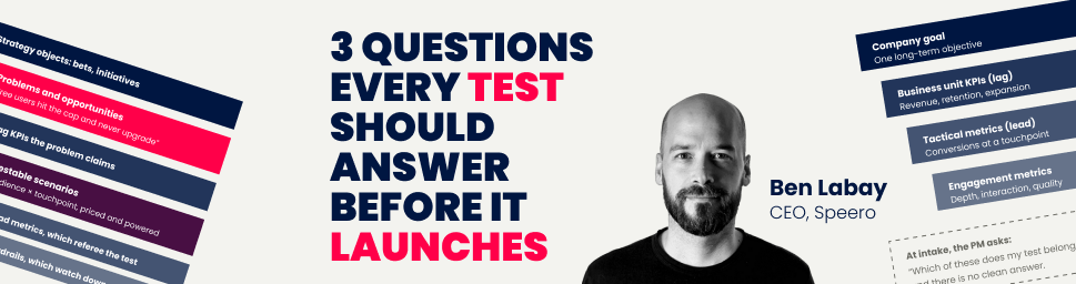
Those three questions are the value layer. They read off one underlying tree, but they live on different objects, and conflating them is where programs go wrong.
Figure 1. The three faces. Same tree underneath, three different questions, three different objects. The edge word is the tell. "Serves" and "rolls up to" are bookkeeping. "Drives" is a claim.
How do you connect an A/B test to company strategy?
The classic goal tree is metric-shaped. A company goal at the top, five to seven business unit KPIs under it, tactical metrics under those, engagement metrics at the bottom. It is a good structure and it does real work. It forces agreement on which team owns which metric, makes a small improvement legible as a contribution to a big goal, and exposes missing tracking early.
It also fails at intake, for one specific reason. A product manager does not think in metric cascades. A product manager thinks free users hit the cap and never upgrade.
So when the system asks which metric node a test belongs to, the honest answer is several of them, or none of them cleanly. The strategy gate becomes a formality everyone learns to click through.
So insert a layer. Between strategy and metrics, put problems.
Figure 2. The problem layer is the change that makes the tree usable at the point of intake. Problems are written as problems, never as solutions. The client's initiative tables already hold the solutions.
With problems in the middle, the strategy gate becomes enforceable rather than aspirational. No experiment record without a problem link. That single rule buys you the ability to open any bet and see every test underneath it, including the bets with nothing underneath them, which is usually the more interesting finding.
Build the bridge, do not rebuild the top
Almost every client already owns the top of this tree and the bottom of it. They have bets or initiatives or OKRs in one system and a metric dictionary in another. What they do not have is the connection.
Resist the urge to wire directly into their strategy tables. Relations in most tools are two-way, so a direct integration sprouts backlink fields on tables another team owns, couples your schema to their planning cycle, and imports their rows, which are solutions rather than problems, straight into the layer that needs to be problem-shaped.
Default to a thin bridge instead. 10 to 15 curated problem rows living in the experimentation workspace, each carrying a plain one-way link back to the strategy row it serves. Zero footprint on tables you do not own, no sign-off needed for version one, and the middle layer gets to be the shape it needs to be. Keep it small and review it at each planning checkpoint. Mirroring a 400-row roadmap is the drift trap.
Two kinds of arrows
Here is the failure this whole section is guarding against. A tree that connects strategy, metrics and experiments will mix two relationship types that look identical on a diagram and mean completely different things.
Figure 3. The two edge types. Drawn identically, they let a bookkeeping link read as a bet-the-roadmap belief. Putting the two edge types on different objects is what fixes it. A better diagram will not.
This has a practical consequence for the metric dictionary. The parent relation between two metrics is an accounting roll-up and nothing else. New business revenue equals signup volume times conversion rate times value per conversion. That is definitional math, true by construction. Mark it as an identity and keep every hunch out of it. Any parent link that is really a hypothesis is a causal claim hiding in the plumbing, and it belongs in face three.
The same rule governs tags: A theme, mechanism or cognitive-bias label classifies the intervention you built. It never explains the result. "This won because of social proof" is a causal claim, and it belongs on a graded row like any other, not smuggled onto a classification field where it carries no assumption, no grade and no evidence.
How do you size an A/B test?
This is the face most programs already have, in some form. A pipeline value calculator, a test bandwidth model, a spreadsheet somebody maintains. The value layer version is one row per scenario. A scenario is an audience, a touchpoint and a declared measurement basis. Volume, baseline rate and value per conversion go in. Two numbers come out that change behavior.
Two things about that block. The planning lift is one conservative constant the client ratifies once, five percent being the common default, and it lives in exactly one place so that changing it reprices everything downstream. And the MDE figure is meaningless without the window it assumes, so the window goes in the field name, always.
Power is a property of the scenario, not of the metric. The same metric can be Tier 1 on one surface and hopeless on another, so tiers live on scenario rows and never as a global stamp on a metric.
What a sized table looks like
Below is an illustrative table for a consumer ecommerce program on a two-week window, with thresholds ratified at Tier 1 for a detectable lift of 2.5% or less, Tier 2 at 5% or less, Tier 3 above that. Every number here is invented for the purpose of showing the shape. None of it comes from a client.
Figure 4. Illustrative scenario table. Numbers are invented to demonstrate the structure, computed at 80% power, 95% confidence, 50/50 split, two-week window, 5% planning lift. The aggregate row is marked and grayed because it contains the detail rows; never sum it with them and never rank it against them.
Three things in that table are worth stopping on.
The aggregate row is the only Tier 1 surface in the system. That is normal and it is worth saying out loud, because it means most of what the team wants to test individually cannot referee a normal-sized win on its own. Aggregate rows are legitimate and often match how the business already values broad changes. They are also the easiest way to double-count, so they get marked and kept out of every rollup that contains their children.
The guides hub has 26,000 monthly visits and $351 a month of potential at the planning lift. The runtime formula says 710 weeks. That is correct and usefully absurd, and it is the row that ends an argument about whether the content team should get testing bandwidth.
And the cancel flow, which carries the highest value per conversion in the table by more than seven times, is Tier 3.
Money is downstream, power is upstream
That last one is structural rather than accidental. The funnel behaves like a river. All the water is upstream, where you can measure almost anything and each conversion is worth very little. The gold is at the mouth, where the flow has already thinned to the point that you cannot pan enough of it to prove anything.
So revenue rank and power rank pull against each other, on almost every program, and no amount of tooling resolves it.
The tree makes the tension visible. But the doctrine resolves it. Run fast on the lead, guard the lag.
Lag metrics are what the business actually wants. Revenue, churn, expansion, retention. They are also rare, slow and noisy, which makes them terrible referees for a two-week read at most companies' traffic. Lead metrics are causally upstream, higher volume and faster to mature.
So the powered lead metric referees the test. The lag metrics enter as pre-committed guardrails and as rows in a decision matrix, and they get their decisive read after ship, through time-series causal inference around the rollout date and 30/60/90-day cohort curves. Retroactive holdouts are biased by construction and are never the answer. Users pulled back are being deprived of an experience they have had for weeks, and static holdouts drift from the evolving product.
The objection that arrives in almost every executive conversation is that lead and lag move in opposite directions. Sometimes they do, by design. A test built to attract higher-intent buyers should depress signups. That is a trade you pre-register. Write the matrix cell before launch: lead down, revenue per user up, equals win. The value layer converts an after-the-fact argument into a before-the-fact agreement.
The bracket, and how to read its direction
Display potential at the planning lift beside potential at the detectable MDE. The pair brackets the sizing, and the bracket is itself diagnostic.
One standing caveat travels with every MDE figure. Detectable is not expected. A surface that can resolve a 2.5% lift will still read flat on most tests, because typical web effects are low single digits. Flat is a pre-committed outcome you agreed to before you saw the data.
Figure 5. Illustrative, four rows from Figure 4. The aggregate and the content-hub rows are left out for scale; the content hub inverts hardest of all, at $351 against $6,616. The inversion is a tier warning anyone in the room can read without doing arithmetic.
Which brings up the request that will come, reasonably, once a client has seen the table. A flat planning lift across every scenario feels blunt, so why not size potential on each row's MDE instead?
Refuse, on two grounds. MDE is a property of the measuring instrument, not of the opportunity. Run the same test for four weeks instead of two and MDE drops by the square root of two, so potential falls about 29% with no change whatsoever to the business. And it inflates exactly the wrong rows. A dead page nobody measures well carries an enormous MDE and would price above a flagship surface that is measured properly. The best-instrumented thing you own gets marked down for being well instrumented.
If a flat constant is genuinely too blunt, vary the lift by what is being built, never by how well it can be measured. Better still, wait. Once 20 or so tests have resolved, the observed distribution of discovered against potential answers the question with evidence instead of opinion.
One shortcut, and where it breaks
When analytics access is blocked and all you have is conversion counts, there is a fallback. For small baseline rates, detectable relative MDE depends almost entirely on the number of conversions in the window.
MDE_rel (%) ≈ 100 × 5.6 / sqrt(conversions in window)
On the lower-traffic calibration, where Tier 1 means a 10% detectable lift over four weeks, roughly 3,100 conversions in the window gets you there and roughly 780 gets you a 20% Tier 2 bar. Recalibrate against whatever thresholds and window the program ratified. A single period-labeled export is then enough to power an entire table.
Use it as a fallback, because it drops the (1 − p) term and therefore fails where baseline rates run high. Checkout, add-to-cart and activation surfaces routinely convert at 80 to 90 percent, and those are the highest-value rows in the table.
Figure 6. Illustrative, four rows from Figure 4. Record which derivation produced each figure. In a mixed-rate table the method is itself provenance and belongs in a field, not in a note somewhere else.
How do you know if a winning test actually proves your hypothesis?
A winning test and a true belief are two different things, and most programs treat them as one.
You ship a variant, it lifts the lead metric, you log the win, you move on. What never gets written down is the thing you actually learned about what moves the business. So a year of wins accumulates and the program still cannot answer what it believes drives revenue without someone opening a whiteboard.
Notice that there are two claims in a typical readout, not one. The test moved the lead metric is a measured fact. That lead metric drives the lag KPI is a separate claim, usually assumed, usually never graded. Collapsing them is quiet over-claiming, and it is what makes a goal tree feel dishonest to anyone who looks at it hard.
Face three is one object. One row per hypothesized causal link between two metrics, carrying a direction, the assumption in one line, a provenance grade, and links to the evidence.
Figure 7. The loop that makes the causal map compound. A win no longer just closes a ticket. It upgrades a belief.
Start narrow. Take the highest-leverage lag KPI and the two or three lead metrics the roadmap is currently betting drive it. Model the beliefs the program is spending money on, not every link that could exist. Most seed rows will start at Assumed, and the count of Assumed links is an honest picture of where the program actually stands.
The separation matters here as much as anywhere. If a link is definitional math, it is an accounting roll-up on the metric parent relation and it does not belong in this table. If it is a belief that could turn out to be wrong, it is a row.
In a review, this changes what gets prioritized AKA which belief a test would validate, weighting the beliefs that carry the most and are evidenced the least, rather than by dollar size alone. Say "a win here upgrades this belief from Assumed to Measured" and mean it structurally. Report evidence quality as a program health metric alongside velocity and win rate. And stop over-claiming, because the two gradeable statements stay separate on the record.
What should an experiment intake form ask for?
None of this matters if it lives in a strategy document. The test of a working install is mundane. Someone scoping a test picks the surface they always pick, and the record answers three questions with no extra effort from them.
Figure 8. The commercial gate is the only one that fills itself, which is why it can be enforced rather than politely skipped.
Two vocabulary rules carry the integrity of everything above. Potential revenue attaches at intake and is prioritization currency: good for ranking, never for forecasting. Discovered revenue is logged at the decision, from measured effects only. Reconciling the two over time is the revenue story in the quarterly review and the program's actual ROI evidence.
Both sides of that ratio have to be the same unit and the same period, which sounds trivial and is the single most common live bug in an inherited system. A potential figure annualized at one lift sitting beside a discovered figure logged monthly produces a ratio wrong by an order of magnitude, with nothing on the record revealing it. Put the period in the field name. Monthly is the sane standard, because it is the unit the sizing math already produces.
Name the denominator
One more field, and it earns its keep despite looking like pedantry. Every scenario declares its measurement basis, whether that is page viewers, landing entrances, event-scoped or aggregate. The same surface routinely exists on two bases with incommensurable denominators, and both readings are true. Without the field, nothing stops the table from summing unlike things, and nothing reveals it afterwards.
How do you find the gaps in your testing roadmap?
Roughly a third of the problem rows in a well-built tree should have no testable scenario underneath them. That is deliberate. Strategy with zero presence in the sizing model is a finding, and the tree exists partly to expose it.
The recurring species are consistent across programs. A company-level bet with nothing in the sizing table at all. A revenue-critical touchpoint missing from the touchpoint list entirely, which is why every past test there was sized by hand. A counterparty audience with no rows despite carrying the largest volumes in the business. A metric family the dictionary simply lacks.
Ship the list as a named deliverable and quantify it. Cross two dimensions. One is rows still graded Assumed. The other is tests pointed at Tier 3 surfaces. Where those overlap you have work already committed against numbers nobody measured, aimed at surfaces that cannot settle the question. The dollar figure attached to that overlap is what gets analytics access unblocked.
The sentence that moves a data request: "this share of sized pipeline sits on estimated numbers and surfaces that cannot referee a test."
What do you need to decide before rolling this out?
Traceability first, causality second. Traceability is cheap because it reuses tables the client already has, and it is the face that makes the strategy gate enforceable. Causality is a new object plus a discipline, and it lands better once the tree is there to hang it on.
Before anything gets built, five decisions need ratifying, each of which reprices everything downstream if you change it later.
- Bridge or direct. How the value layer connects to strategy tables you do not own. Default to the bridge.
- One tree or several. Default to one canonical tree with team-filtered lenses. Parallel trees recreate the silo problem the tree exists to solve.
- Tier thresholds, the window they assume, and the MDE unit standard. Never a threshold without its window.
- The planning lift constant. One number, one place.
- The period standard for every currency field. Monthly, in the field name.
Then audit before you propose. Units and denominators first, always, and audit the experiment records too, not just the sizing table, because mixed assumptions hide on the records. Pull real volumes and baselines and recompute detectable MDE yourself. Stored MDE values are usually aspirations or value-model inputs rather than power calculations.
Build version one of the tree from the client's own tables and data, then put it in front of stakeholders to correct. A data-derived draft plus one hour of validation beats a blank-canvas workshop on every axis. It respects senior time, it anchors debate on evidence, and it surfaces disagreement about wording rather than about existence.
Bring the power tiers computed. The moment a room sees that one of its named strategic bets sits on a surface that cannot detect a normal win, the argument about whether any of this is worth doing is over.
Where should this value layer live in your experimentation program?
Two bodies of work sit behind this. The product operating model supplies the risk logic and the org shape, with discovery and delivery running in parallel against the four risks of value, usability, viability and feasibility. Continuous discovery supplies the weekly mechanics, meaning the opportunity tree, the product trio and the habit of talking to customers.
Neither operationalizes what an outcome is worth, whether the test aimed at it can statistically resolve, or how good the evidence is for the belief underneath it. Principles do not price a roadmap. Habits do not survive a reorg.
The value layer is the part that lives in the system of record instead of on a whiteboard. It's priced at intake, gated at the door, recorded at the decision, and reconciled against revenue over time. And every causal belief graded by evidence rather than asserted by an arrow.
Three questions, one tree, three objects. Most programs have built one of the three. The other two are cheaper than they look.
A note on the numbers. Every figure, table and worked calculation in this article is illustrative and invented to demonstrate structure. Nothing here comes from client data. Power figures are computed for a two-arm 50/50 test at 80% power and 95% confidence on a proportion metric, using the standard normal approximation, with the window stated alongside each result. Tier thresholds and the planning lift constant are decisions to ratify per program, not universal constants.




.svg)
